Just for fun, I've been playing with the finalist data. Here are some ways of visualizing it, using Google Fusion Tables, which seems to have gained some features and lost others since I began playing with it a couple years ago.
If you don't see anything below, it might be your browser. Based on what I've seen in my Google Analytics stats for the site, though, most of you should be fine.
First let's look at top 10 degrees:
Second, top 10 Universities:
One of the newer features is one where we can explore the links between data elements. This one is for the link between University and Degree:
Next up, we can map out the locations of the schools, in case anyone wants to explore that way.
And last, but not least, your breakdown of Veterans' Preference.
Anything else you'd like to see?
Showing posts with label data analysis. Show all posts
Showing posts with label data analysis. Show all posts
Friday, April 12, 2013

Friday, May 20, 2011
Question: Where Should the In-Person Assessments Have Occurred?
This is definitely something exploratory, and it's certainly not intended to be predictive. I am just musing here, partially to determine whether the in-person assessment locations were sound or not.
So the question is this: Based on what we know of the 2011 semifinalist pool, where would the most effective in-person assessment locations have been? Let's broaden that a bit to get at what we really might want to know. Which cities with a Federal presence would have made good cities in which to conduct PMF in-person assessments, based on what we know about where the semifinalists (those invited to the in-person assessments) presumably originated? I hope that's a clear question, but we can break this down into components so the criteria are better defined, and the follow-up questions are enumerated.

One thing you'll notice, of course, is that Washington, DC, is listed here, even though it's not an FEB location. I trust you'll understand why this is the case. Regardless, what we see is that, outside Washington, DC, the top 5 FEB locations are Boston (161), Atlanta (118), New York City (110), Chicago (92), and San Francisco (76). If we were looking for validation of the 2011 in-person assessment location choices, this might suffice. What the top 5 FEB list doesn't really account for, though, is that there are significant numbers in other locations. The trick here would be to determine locations that are central to a region in some way. DC makes sense for most of the East Coast, especially given the ease of transportation between, for instance, Boston and DC. It is entirely fitting, then, to keep DC as an assessment location. Atlanta also makes sense for large portions of the South. The Midwest is well served by Chicago, and the West Coast is well served by San Francisco (although Los Angeles looks to be a good second choice). That just leaves areas like the North Plains and the Southwest less well served. But we can frame a different question that might help here. Let's eliminate all but one NE city (DC), one Southern city (Atlanta), one Midwest city (Chicago) and one Western city (San Francisco), leaving the others on the list to see what we can come up with. That leaves us with the following:

Based on this, I think we can recommend that either a city in Texas or Oklahoma City could serve as the only other location needed. I am choosing OKC because of its fairly central location compared to Denver and Albuquerque. If we do that, then the numbers look like this:

Even so, the payoff for adding OKC is much lower than other locations, and it may not ultimately be worth the effort to add the assessment location.
Next, let's see if we can determine whether there's a distance factor involved here. That is, if we take these five locations, is there an average distance we're looking for that might be ideal? The first table shows us a widely variable average distance between the school and the assessment center.

The largest average is for DC, but this can be partially explained by the large distribution of semifinalists (Boston to a point about halfway between Atlanta and DC) and the inclusion of overseas schools in this list, all of which are in excess of 2000 miles away. There aren't many, but they are enough to affect the result. Filtering those out will give us perhaps something more meaningful.

So there you have it. These are pretty good distances from what I can tell, but I am interested to know what you all think. As one final point of comparison, here are the average distances to the original in-person assessment locations. By omitting OKC, we raise the averages for Chicago, San Francisco, and Atlanta, but DC is unaffected.

Conclusion
So after examining the locations that might have made sense for the in-person assessment, what we found is that the original locations seemed to be about right. We could fragment the assessment centers a bit more by adding one in OKC, but doing much more than that seems to have a lower benefit. What do you all think? Were these distances doable for you? I know many of you would have preferred not to travel as far as you did, but consider the alternatives (such as all in-person assessments being held in DC). What locations do you think should be considered?
So the question is this: Based on what we know of the 2011 semifinalist pool, where would the most effective in-person assessment locations have been? Let's broaden that a bit to get at what we really might want to know. Which cities with a Federal presence would have made good cities in which to conduct PMF in-person assessments, based on what we know about where the semifinalists (those invited to the in-person assessments) presumably originated? I hope that's a clear question, but we can break this down into components so the criteria are better defined, and the follow-up questions are enumerated.
- Federal presence: This can mean one of a few things. First, and fundamentally, is there any Federal agency with an office in the city? For many cities, the answer is a qualified yes. Qualified, because even if a city has some Federal presence, this does not mean that the city is at all suited to hosting in-person assessments, either because it is located too far away from the bulk of semifinalists, or because it is simply too small to provide convenient transportation options. It turns out there is another way we can measure Federal presence in a city: The Federal Executive Boards (FEB). FEBs form a nationwide network of Federal branches providing communication and collaboration solutions to agencies outside the DC area. Given their wide geographic distribution, it seems clear that FEB cities might serve as a good starting point to analyze future in-person assessments. In the graphics below, I show a summary view of how many semifinalists were listed as closest to each of these cities.
- Semifinalists: I chose semifinalists from this year 1) because there were semifinalists for 2011, and 2) because semifinalists were the ones invited to take in-person assessments. It doesn't make much sense to me to choose nominees or finalists for this particular comparison, although choosing nominees would at least provide some information for future planning. What we know about semifinalists is the school they listed in their materials, and not much more. This is a limitation of the data set, of course, but it's all we have to work with. What we have to assume from it is that the schools in question were correctly identified for purposes of geolocation; that every semifinalists were correctly listed with their schools; and that the locations of the schools reflect the geographic origins of the semifinalists. That's a tall order, but again, what choice do we have? Some of these schools conduct extensive online programs that mean students could be widely dispersed beyond the brick-and-mortar campus. What we have, then, is close enough approximation of the truth for this analysis.

One thing you'll notice, of course, is that Washington, DC, is listed here, even though it's not an FEB location. I trust you'll understand why this is the case. Regardless, what we see is that, outside Washington, DC, the top 5 FEB locations are Boston (161), Atlanta (118), New York City (110), Chicago (92), and San Francisco (76). If we were looking for validation of the 2011 in-person assessment location choices, this might suffice. What the top 5 FEB list doesn't really account for, though, is that there are significant numbers in other locations. The trick here would be to determine locations that are central to a region in some way. DC makes sense for most of the East Coast, especially given the ease of transportation between, for instance, Boston and DC. It is entirely fitting, then, to keep DC as an assessment location. Atlanta also makes sense for large portions of the South. The Midwest is well served by Chicago, and the West Coast is well served by San Francisco (although Los Angeles looks to be a good second choice). That just leaves areas like the North Plains and the Southwest less well served. But we can frame a different question that might help here. Let's eliminate all but one NE city (DC), one Southern city (Atlanta), one Midwest city (Chicago) and one Western city (San Francisco), leaving the others on the list to see what we can come up with. That leaves us with the following:

Based on this, I think we can recommend that either a city in Texas or Oklahoma City could serve as the only other location needed. I am choosing OKC because of its fairly central location compared to Denver and Albuquerque. If we do that, then the numbers look like this:

Even so, the payoff for adding OKC is much lower than other locations, and it may not ultimately be worth the effort to add the assessment location.
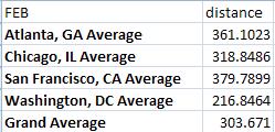
Next, let's see if we can determine whether there's a distance factor involved here. That is, if we take these five locations, is there an average distance we're looking for that might be ideal? The first table shows us a widely variable average distance between the school and the assessment center.

The largest average is for DC, but this can be partially explained by the large distribution of semifinalists (Boston to a point about halfway between Atlanta and DC) and the inclusion of overseas schools in this list, all of which are in excess of 2000 miles away. There aren't many, but they are enough to affect the result. Filtering those out will give us perhaps something more meaningful.

So there you have it. These are pretty good distances from what I can tell, but I am interested to know what you all think. As one final point of comparison, here are the average distances to the original in-person assessment locations. By omitting OKC, we raise the averages for Chicago, San Francisco, and Atlanta, but DC is unaffected.
Conclusion
So after examining the locations that might have made sense for the in-person assessment, what we found is that the original locations seemed to be about right. We could fragment the assessment centers a bit more by adding one in OKC, but doing much more than that seems to have a lower benefit. What do you all think? Were these distances doable for you? I know many of you would have preferred not to travel as far as you did, but consider the alternatives (such as all in-person assessments being held in DC). What locations do you think should be considered?
Tuesday, April 19, 2011
More PMF Finalist Data Visualizations
This is just a quick, fun update, an excuse to aggregate some data and display it in pretty charts for you. Good luck at the job fair, everyone! It looks like I will be at the GovLoop happy hour tomorrow after all, so look for a guy in a luchador mask ;)
The bar chart below is a Google Fusion Tables visualization of the absolute number of finalists year on year for the 10 top academic fields. That is, I took the ten academic fields that have produced the most PMF finalists in all the data years I have, then looked at each one in terms of how many finalists graduated with those degree fields in each year. It's obvious from this that the single largest group of finalists have law degrees, and other two of the top three fields are International Affairs/Administration/Studies and Public Administration/Policy. I don't think there's anything here that you didn't already know.
I also did this with the ten schools that have produced the most PMF finalists from 2009-2011. Again, we can see some pretty obvious things. First, four schools absolutely crush all of the others in terms of representation among finalists: George Washington, Georgetown, Johns Hopkins, and Harvard. Perhaps interestingly, the total number of finalists from these schools decrease in order of increasing distance from OPM (GW is right across the street from the OPM building, FYI).
These charts reinforce things we already know, or that we think we know. What about looking at the data a different way? After thinking about it, I tried sorting to see if there were any schools with finalists this year that didn't have any in 2009 or 2010. I came up with 57, and all but six of them fielded only 1 finalist this year. These are listed below.
I think there are some other ways I can explore this data, especially once it has all been completely loaded into my database for programmatic manipulation, aggregation, and such. As I get time and finish the imports, I will produce more of this.
The bar chart below is a Google Fusion Tables visualization of the absolute number of finalists year on year for the 10 top academic fields. That is, I took the ten academic fields that have produced the most PMF finalists in all the data years I have, then looked at each one in terms of how many finalists graduated with those degree fields in each year. It's obvious from this that the single largest group of finalists have law degrees, and other two of the top three fields are International Affairs/Administration/Studies and Public Administration/Policy. I don't think there's anything here that you didn't already know.
I also did this with the ten schools that have produced the most PMF finalists from 2009-2011. Again, we can see some pretty obvious things. First, four schools absolutely crush all of the others in terms of representation among finalists: George Washington, Georgetown, Johns Hopkins, and Harvard. Perhaps interestingly, the total number of finalists from these schools decrease in order of increasing distance from OPM (GW is right across the street from the OPM building, FYI).
These charts reinforce things we already know, or that we think we know. What about looking at the data a different way? After thinking about it, I tried sorting to see if there were any schools with finalists this year that didn't have any in 2009 or 2010. I came up with 57, and all but six of them fielded only 1 finalist this year. These are listed below.
I think there are some other ways I can explore this data, especially once it has all been completely loaded into my database for programmatic manipulation, aggregation, and such. As I get time and finish the imports, I will produce more of this.
Saturday, April 2, 2011
2011 PMF Data Visualization: Semifinalists vs Finalists
[Also posted here]
I spent a good deal of time gathering and sifting through the lists of 2011 semifinalists and finalists, cleaning up school names and gathering latitude and longitude information for each of the schools I saw represented in the data sets. At present, I have not had a chance to do the same for the nominees list, because it is so much larger than the other two sets of data. Once I do, I will showcase what I find, hopefully presenting it in a nice interactive tool so that you can see the sheer drop-off in numbers, especially as a function of geographic distribution.
In the mean time, what I present here are two graphics I extracted from my current visualization efforts, which seek to present this year's PMF program in terms of its geographic distribution. It is of course centered on the US, not only because there are many fewer applicants from non-US schools, but also because I had to have a starting point to make my representation. I will adjust my visualization settings later to indicate the scales of the global distribution of this program, which in some ways out-performs the reach of the PMF program in a certain class of schools within the US (I mean in this case HBCUs, or historically black colleges and universities, whose representation in the PMF program has been marginal in the past). All this is to say that more visualizations are forthcoming just as soon as I can find meaningful ways to express them.
Now let's get on to some graphics. You will want to open these up to see them full size, since this blog theme limits their visibility considerably.

In this first image you can see the geographic distribution of the 2011 semifinalists. The markers are sized according to the number of semifinalists from each of the nominating schools (though see below for some additional detail on my cleanup approach). The legend below indicates the relative sizes, and I should point out that the largest circle is for schools that had 60 or more semifinalists. In all, there were approximately 280 schools represented among the 1530 semifinalists. You will no doubt notice the heavy presence of East Coast schools, especially centered around DC, which should be no surprise; what may be surprising are the volume of semifinalists at Upper Midwest and West Coast schools.

In this second image, which depicts the schools with finalists, you can see a very noticeable decline in the scales of semifinalists and a less noticeable drop in the scope of geographic distribution. Gone is the apparent advantage exhibited in the previous graphic of both the West Coast and Upper Midwest schools. It is quite obvious that East Coast schools are massively overrepresented in this program (and someone has already done a breakdown of degree programs, so we know what that picture looks like). Since there were many schools with single digit nominees, it is also expected that there would be fewer schools represented in the finalists data. From 280 in the semifinalists round, we drop to 210 schools among 858 finalists. That is, approximately 25% of the schools that were represented in the semifinalists data ultimately failed to put forward finalists this year. This is a testament to both the competitiveness of the program and the long road it still has ahead of it to market itself to every eligible graduate school.
Finally, let me talk a bit about the data. The biggest challenge in an operation like this is that with so many data points to deal with, it is incredibly difficult to conduct 100% quality control. There are errors in the data, and I am aware of a few that I have not corrected yet. Additionally, the PMF Program Office, in conjunction with the schools who feed it their nominees, tends to make what I would consider needless distinctions in the school names. For instance, in the lists on the PMF site, you may notice that Harvard has four or five distinct names, one for Harvard University, and the rest for things like the law school, the divinity school, and the like. I realize that students at these schools, and the schools themselves, often pride themselves on such distinctions, but I assure you it makes data analysis an even greater chore. Where possible, I have consolidated schools to the common university names. Besides, it would be utterly meaningless for me to depict semifinalists and finalists at that granularity, because all you would see is a set of concentric circles centered on the latitude and longitude of Harvard, for instance. In addition to name consolidation, I have also expanded each entry to the full text of the school names, which was a prerequisite to gathering the geolocation information. This will become apparent once I am satisfied with and release the interactive tools.
I am interested in what you think of what I've presented, both in my approach and in what the data has to say. Also, let me know what other kinds of views you are interested in. My tools are probably capable of generating pretty much anything, so just let me know.
I spent a good deal of time gathering and sifting through the lists of 2011 semifinalists and finalists, cleaning up school names and gathering latitude and longitude information for each of the schools I saw represented in the data sets. At present, I have not had a chance to do the same for the nominees list, because it is so much larger than the other two sets of data. Once I do, I will showcase what I find, hopefully presenting it in a nice interactive tool so that you can see the sheer drop-off in numbers, especially as a function of geographic distribution.
In the mean time, what I present here are two graphics I extracted from my current visualization efforts, which seek to present this year's PMF program in terms of its geographic distribution. It is of course centered on the US, not only because there are many fewer applicants from non-US schools, but also because I had to have a starting point to make my representation. I will adjust my visualization settings later to indicate the scales of the global distribution of this program, which in some ways out-performs the reach of the PMF program in a certain class of schools within the US (I mean in this case HBCUs, or historically black colleges and universities, whose representation in the PMF program has been marginal in the past). All this is to say that more visualizations are forthcoming just as soon as I can find meaningful ways to express them.
Now let's get on to some graphics. You will want to open these up to see them full size, since this blog theme limits their visibility considerably.

In this first image you can see the geographic distribution of the 2011 semifinalists. The markers are sized according to the number of semifinalists from each of the nominating schools (though see below for some additional detail on my cleanup approach). The legend below indicates the relative sizes, and I should point out that the largest circle is for schools that had 60 or more semifinalists. In all, there were approximately 280 schools represented among the 1530 semifinalists. You will no doubt notice the heavy presence of East Coast schools, especially centered around DC, which should be no surprise; what may be surprising are the volume of semifinalists at Upper Midwest and West Coast schools.

In this second image, which depicts the schools with finalists, you can see a very noticeable decline in the scales of semifinalists and a less noticeable drop in the scope of geographic distribution. Gone is the apparent advantage exhibited in the previous graphic of both the West Coast and Upper Midwest schools. It is quite obvious that East Coast schools are massively overrepresented in this program (and someone has already done a breakdown of degree programs, so we know what that picture looks like). Since there were many schools with single digit nominees, it is also expected that there would be fewer schools represented in the finalists data. From 280 in the semifinalists round, we drop to 210 schools among 858 finalists. That is, approximately 25% of the schools that were represented in the semifinalists data ultimately failed to put forward finalists this year. This is a testament to both the competitiveness of the program and the long road it still has ahead of it to market itself to every eligible graduate school.
Finally, let me talk a bit about the data. The biggest challenge in an operation like this is that with so many data points to deal with, it is incredibly difficult to conduct 100% quality control. There are errors in the data, and I am aware of a few that I have not corrected yet. Additionally, the PMF Program Office, in conjunction with the schools who feed it their nominees, tends to make what I would consider needless distinctions in the school names. For instance, in the lists on the PMF site, you may notice that Harvard has four or five distinct names, one for Harvard University, and the rest for things like the law school, the divinity school, and the like. I realize that students at these schools, and the schools themselves, often pride themselves on such distinctions, but I assure you it makes data analysis an even greater chore. Where possible, I have consolidated schools to the common university names. Besides, it would be utterly meaningless for me to depict semifinalists and finalists at that granularity, because all you would see is a set of concentric circles centered on the latitude and longitude of Harvard, for instance. In addition to name consolidation, I have also expanded each entry to the full text of the school names, which was a prerequisite to gathering the geolocation information. This will become apparent once I am satisfied with and release the interactive tools.
I am interested in what you think of what I've presented, both in my approach and in what the data has to say. Also, let me know what other kinds of views you are interested in. My tools are probably capable of generating pretty much anything, so just let me know.
Monday, April 19, 2010
Data Call
Does anyone out there feel like helping out with some data analysis? It might not be helpful or interesting to those who made it to finalist status this year, but those who are thinking of applying this fall should be interested in what we can find out.
I am looking at some specific questions, and I need some data that doesn't appear to be immediately forthcoming. If necessary, I will hunt it down. The questions are:
To answer these questions, I need one dataset that I don't already have: the number of US graduate schools (and preferably a full list).
If I can get this, I still need to clean up the data so it can be compared in databases.
I really don't care about anything but aggregate statistics. With any luck, this data can be collected and analyzed several years in a row (so back data is also appreciated).
Any takers?

I am looking at some specific questions, and I need some data that doesn't appear to be immediately forthcoming. If necessary, I will hunt it down. The questions are:
- Of all accredited graduate schools in the US, what percentage produced PMF nominees in 2010?
- What was the performance rate of all PMF-nominating schools in 2010? That is, of schools who nominated, how many became finalists?
- What is the overall PMF performance rate of accredited graduate schools in the US?
- Of all Historically Black Colleges and Universities, what is the performance rate (nominees to finalists)? How does that compare to the larger set of schools?
To answer these questions, I need one dataset that I don't already have: the number of US graduate schools (and preferably a full list).
If I can get this, I still need to clean up the data so it can be compared in databases.
I really don't care about anything but aggregate statistics. With any luck, this data can be collected and analyzed several years in a row (so back data is also appreciated).
Any takers?
Subscribe to:
Posts (Atom)